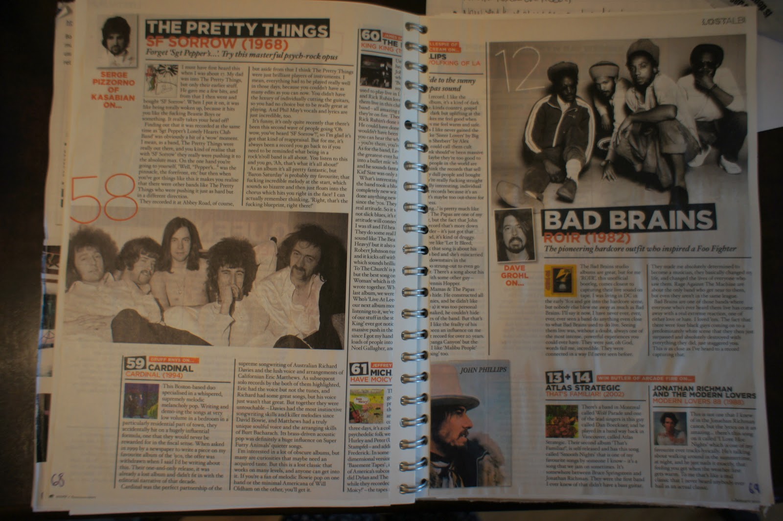
Tuesday, 15 March 2011
These pictures are taken from my sketchbook of research prior to the production of my final campaign. I have uploaded them to my blog to show the link between thyeresearch on NME that i did and my final piece's style. This is particularly evident in my magazine style leaflet which mirrors NME layout. NME is a magazine which is popular with both men and women and i think that is ideal for a gender neautral target audience.
TEA STAINS.
For my leaflets I want the background to be distressed. To create this I have tea stained some paper. I think this match with the rest of my products but also make it look different and stand out from current STI leaflets. The tea stained finish is youthful as the vintage, old, style is very fashionable at the moment. For my product to be read it is important that they are in keeping with the lifestyle of my target audience.
REAL LIFE STORY IMAGERY
These are a selection of the photograph's I took for my real life story imagery. The main story is about a young girl who has caught Chlamydia. I have chosen a model that is a typical 17 - 18 year old therefore making the story relatable to the reader. The story is written in first person and it’s a very personal account of her story and what’s happened.
In all the pictures the model is positioned to the left of the shot. I think it is more effective to have the model away from the centre. It makes the photograph have more depth and look less flat. I wanted to do a variety of shots – while they are all simple and ordinary to match the real life theme, I have experimented with the model looking into and away from the camera. Looking away makes the model look ashamed however I think for a young target audience, it is more important to look directly at the reader and make it feel hard hitting.
I only need on picture of the model to fit into the layout I have planned. I am therefore going to use the second image. She is sat on the floor and the camera is looking down on her, which makes her look belittled and embarrassed. Stylistics are in keeping with the rest of the magazine I am planning – dark colours to fit into the NME vibe. I have altered the photograph by de-saturating and adding to the contrast. To stop her looking to pale and ghost like i have used the burn tool to highlight her facial features and neck.
Wednesday, 9 March 2011
Work in Progress
This print screen shows the progress I am making with my double page spread. It will consist of two real life stories. One a girls experience with Chlamydia and one boy's experience of catching Genital warts after a drunken night out. Both the stories are told in first person which creates a personal direct account of the experience meaning the reader starts to get a sense of empathy. I am writing the stories and laying the pages out on In-Design as it is the most effective way of creating a professional final magazine style leaflet. I will also be keeping true my original plan of using the style of NME.
The colour scheme is black, white and red: simple, striking and gender neutral.
I am very happy with the progress I have made with the double page spread. I simply need to upload a final picture down the right hand side of the boy in the real life story.
The colour scheme is black, white and red: simple, striking and gender neutral.
I am very happy with the progress I have made with the double page spread. I simply need to upload a final picture down the right hand side of the boy in the real life story.
Monday, 7 February 2011
CONTACT SHEET
These are my favourite 20 photographs out of the 70+ I took during my Photoshoot. Putting them onto a contact sheet is helpful as having them alongside each other makes the strongest ones stand out. I think the contact sheet shows how strong the photographs are as I have been finding it difficult to pick my top three pictures to use for the posters. I think the lighting is perfect. The subject is well light but this contrasts well with the black drop which has created a strong dull effect. I am very happy with the range of pose’s meaning that all the posters will link but look different. The model was a perfect choice she resembles the typical 17 – 19 year old girl and i am really pleased with the results overall. The only difficulty I found was making her look naked as if she is in the shower without being to vulgar or revealing.
One of the main things that changed through the Photoshoot was the lighting layout. I planned on using reflectors however i decided they made the subject look shinny and bright which didn’t match the message and feel of the campaign. The lighting equipment was set up like the standard butterfly lighting would be set up. I originally planned to move the lights around however by moving my model into different stances I avoid needing to move the lights. The aperture was set to F22 which meant it was the maximium depth. I wanted everything to be in focus to look crisp and then if wanted any blurred effects i would be able to alter that in Photoshop.
Tuesday, 1 February 2011
Week 6 - Schedule Monitoring.
24th Jan | Photo shoot Plan Book in all equipment and models Models meetings Plan Photoshoot – poses, costumes, materials and props. |
This is the list of jobs I hoped to complete by the end of the week beginning the 24th of January. The schedule I made was there to help me organise my time and going into this week and was on course to finish all proposed jobs.
I have successfully completed all these jobs. Firstly, I organised who I was going to ask to be my model. Then on Monday lunch them we meet and discussed the Photoshoot. I showed her (Ayse Fuat) my flat plans and I made a list of suggested poses, what clothing she would need and make up as these were all important in creating the correct mood.
The next thing I did was make my Photoshoot plan. Not only did meeting the model help me explain to her what I wanted to achieve in the Photoshoot but it helped me clarify what lighting I would need to suit the poses. I decided to try all three lighting techniques to show a variety of skills. The Photoshoot panning document is in a blog below.
The final job I did this week was meet Chris, the lighting assistant to go over my plans. We decided upon a black backdrop to create a moody, negative feel. I also booked my Photoshoot for Monday the 31st lunch time. This Photoshoot will be vital and form the basis of my campaign.
Everything has run smoothly this week and I haven’t had to go into any contingency time. I am not worried about the progress of my work and I think my client would be pleased with the direction of the project as how it is so far, meeting the original schedule and treatment plan.
Subscribe to:
Posts (Atom)